Hey, why is your gun bigger than mine!?! Haha, I used a really small glue gun. Also I didn't think about how busy the background behind me would be. But in the green I kinda like it.
The colors are an obscure homage to the IBM PC CGA color palette 0. The much more common CGA palette was palette 1 with the cyan, magenta, black and white, like this:

But, there were some games that used the yellow, red, green and black palette.
Inspiration from stuff like this:


Obscure, I know.
That's why we are the Retro game club, not the Call of Duty 15 gameclub :-D
Let me know what you think. Modifications can be made if necessary :)
That's cool! I wonder how it would look with the more aggressive palette 1. Maybe I'll try a few palettes (like I'm curious how it would render if I actually map an actual CPC or NES palette, when I'll have time anyway).
ReplyDeleteYeah, this thermal past gun has a capacity for a life time!
I'd be interested to see what you come up with. I'll send you the source files I worked with and you can go from there!
ReplyDeleteCrazy thing, I had to make the resolution of my image match the resolution of yours. I eyeballed it (guessed) and got it to the exact pixel without having to do any precise adjustments. Crazy :)
Well, here's another attempt...
ReplyDeletehttp://organicio.altervista.org/alterpages/files/cyan-magenta-fixed-balances-with-logo.png
See what you think. I tried the "more aggressive" as you said CGA palette. I also tried to reduce the detail in our faces with several filters.
It's hard to reduce the detail while still making us recognizable as people though :)
Still interested to see what you come up with.
I like it one more, it's more old school. :-) I might try something from here, when I get a chance (probably after a few days).
ReplyDeleteOK, I put it up as the logo for now until I get something better from you :)
ReplyDeleteHere's my attempt
ReplyDeletehttps://www.dropbox.com/s/w62azfvx5tc76nt/RGC-logo-3.xcf?dl=0
I've added retro game shots so it's very clear what this is all about, and a third unknown person to convey the idea that others can join.
Here's the Gimp file in case you want to hack it
https://www.dropbox.com/s/w62azfvx5tc76nt/RGC-logo-3.xcf?dl=0
How confusing, here's the png file
ReplyDeletehttps://www.dropbox.com/s/fxrk3j7wkfewd97/RGC-logo-3.png?dl=0
Very nice! I love it.
ReplyDeleteIt's official, I made it the new logo.
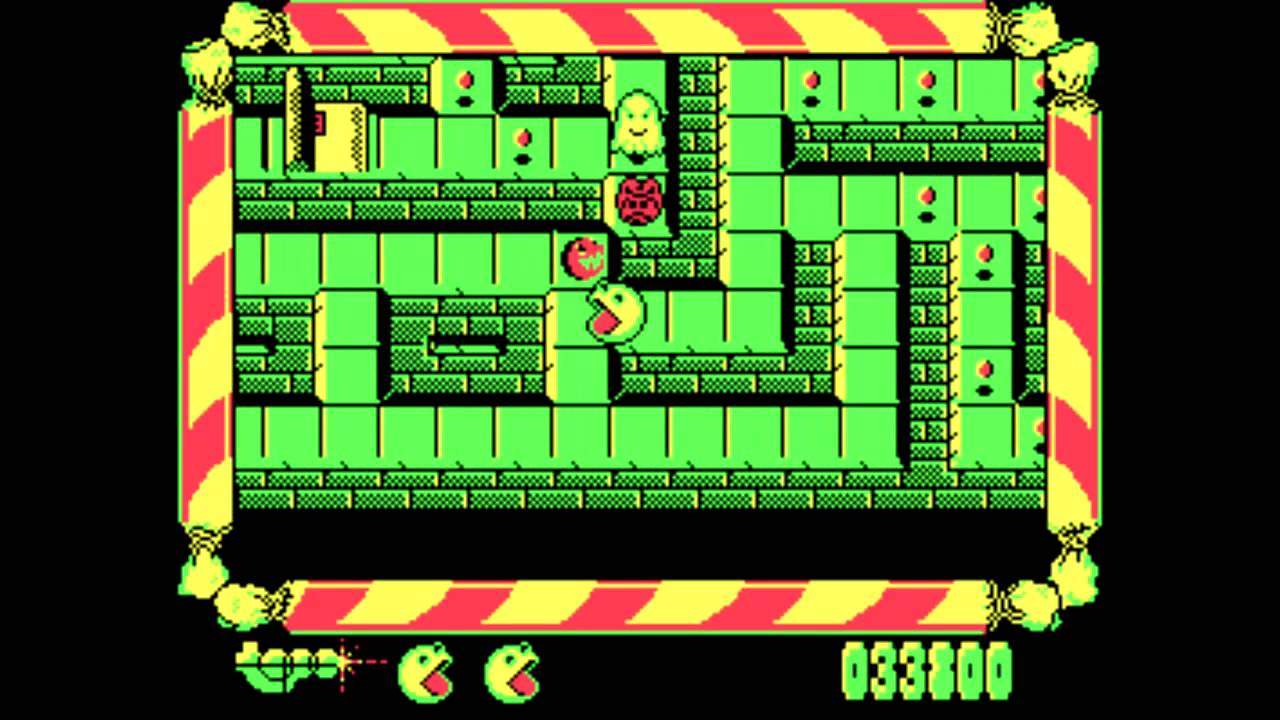
But I have one question, what game is in the bottom right with the orange columns? I don't recognize that one.
OOHHH I see what you did, you put games from my upbringing on my side, and from yours on your side. With both versions of Contra/Gryzor, very cool.
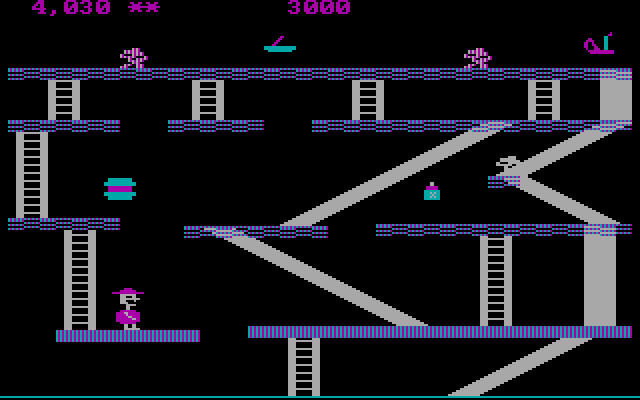
Is that Ketsui in the lower left past Super Ghouls & Ghosts? And what shmup looking games are cut off on the far right of your side?
Very very cool!!!